 TRANSPARENT PNG
Primary symbol
Wolf + house · no lettering · 1254 × 1254 px
WOLF DEN LEADS · BRAND RESOURCES
The Wolf Den Leads brand kit. Logos, colors, typography, and practical guidance for a consistent look wherever the pack shows up.
ZIP · logos, web fonts, color files, and usage guide
FIELD SALES THAT MOVE MARKETS.
01 / THE IDENTITY
Use the text-free symbol with the company name in headers. Choose the full company logo for standalone materials that need to carry the name themselves.
TRANSPARENT PNGWolf + house · no lettering · 1254 × 1254 px
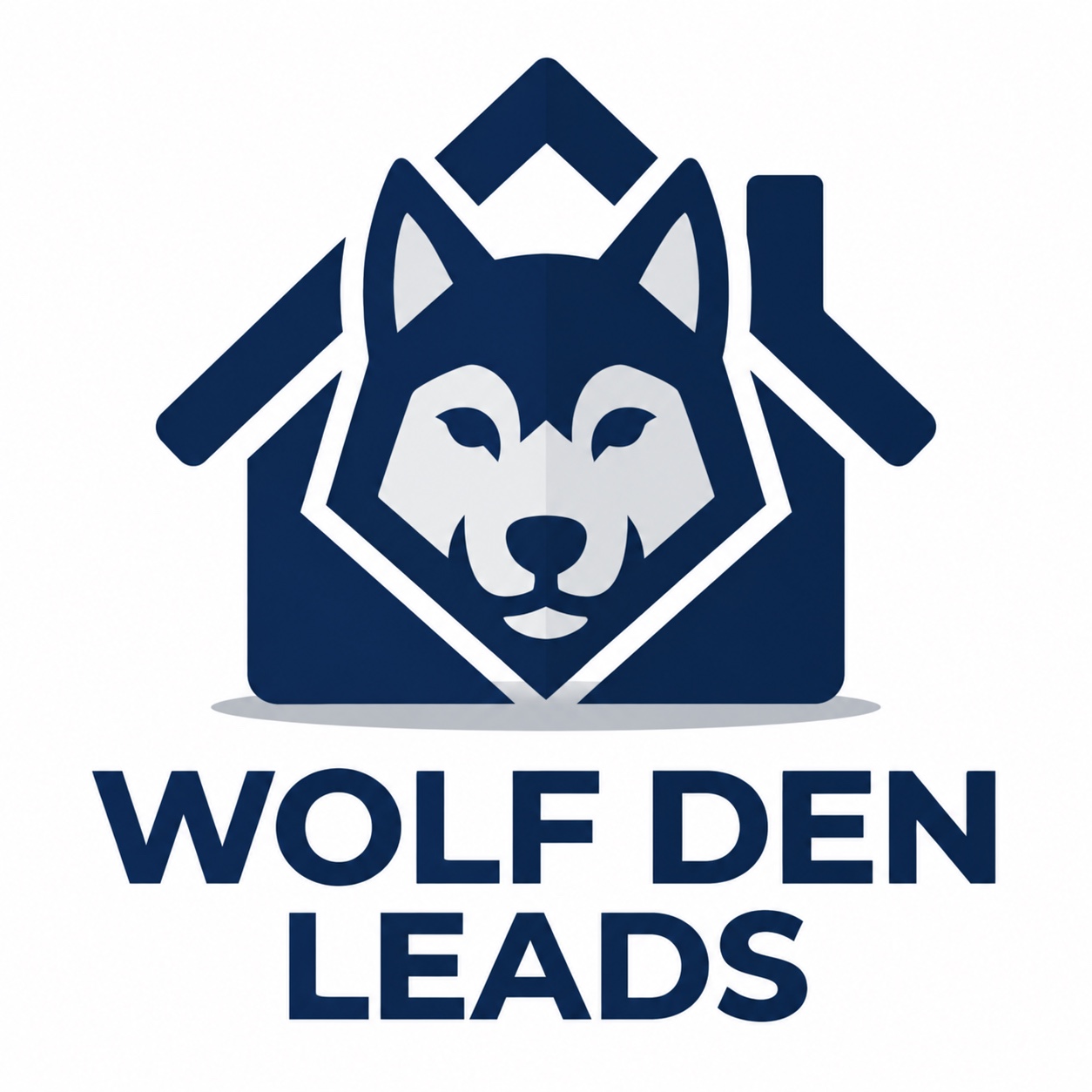 FULL COMPANY LOGO
Symbol + company name · white background
Pair the symbol with the company name once. Use the symbol-only file beside live header text.
02 / THE PALETTE
The main and career websites share a navy foundation with silver accents, open white space, and soft cloud backgrounds. Use the supporting neutrals to create depth.
Select a swatch to copy its HEX code.
03 / THE TYPE
Barlow Condensed gives the main website its bold editorial headlines. Montserrat supports the company wordmark and secondary brand materials, while Inter keeps body copy, forms, and navigation easy to read. All three families are included with their licenses.
Barlow Condensed
Built to move
markets.
Aa Bb Cc Dd Ee Ff Gg
0123456789
Montserrat
Built to move
markets.
Aa Bb Cc Dd Ee Ff Gg
0123456789
Inter
The best conversations
start with clarity.
Aa Bb Cc Dd Ee Ff Gg
0123456789
Font licenses: Barlow Condensed, Montserrat and Inter · SIL Open Font License 1.1. Barlow Condensed is supplied as TTF; Inter and Montserrat are Latin WOFF2 web fonts.
04 / PUT IT TO WORK
A few simple habits keep the identity clear, readable, and consistent across websites, social graphics, presentations, and field materials.
Use the symbol next to live company-name text. Use the stacked company logo when the artwork needs to introduce Wolf Den Leads on its own.
For standalone artwork, leave clear space around the mark of at least one quarter of its width. In compact headers, follow the pairing shown above.
Recommended digital minimums: 40 px wide for the symbol and 160 px wide for the stacked company logo. Keep the original proportions at every size.
Use the navy symbol on white or a light surface. On navy backgrounds, place the symbol inside a white tile so the house outline stays visible.
Use the supplied files, preserve the navy and silver palette, and use the company name once in a header pairing.
Don’t stretch, recolor, rotate, or add effects to the mark. Avoid placing it on busy photography or repeating the full logo beside the same company name.
THE WDL VOICE
Write like a capable teammate: direct, respectful, and clear about the next step. Focus on people, preparation, and follow-through. Keep performance and compensation language specific, with the applicable conditions.
“Field sales that move markets.”
READY FOR THE NEXT TOUCHPOINT
Two logos, three font families, the complete palette, and a practical usage guide.